Appearance
Icon 图标
Element Plus 内置多种 Icon 图标,可参考 Element Plus —— Icon 图标 的文档。 在项目的 /src/assets/svgs 目录下,自定义了 Icon 图标,默认注册到全局中,可以在项目中任意地方使用。如下图所示: 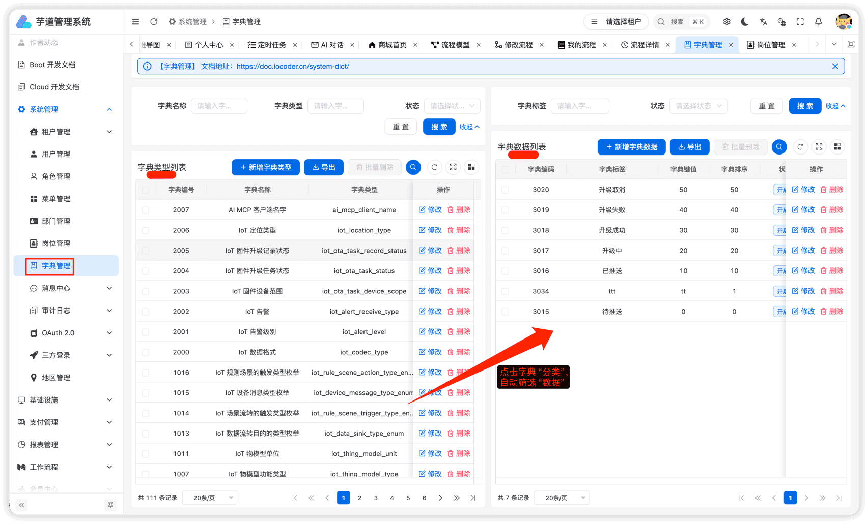
# 1. Icon 图标组件
友情提示: 该小节,基于 《vue element plus admin —— Icon 图标组件 》 的内容修改。 Icon 组件位于 src/components/Icon 内,用于项目内组件的展示,基本支持所有图标库(支持按需加载,只打包所用到的图标),支持使用本地 svg 和 Iconify 图标。 提示 在 Iconify 上,你可以查询到你想要的所有图标并使用,不管是不是 element-plus 的图标库。
# 1.1 基本用法
如果以 svg-icon: 开头,则会在本地中找到该 svg 图标,否则,会加载 Iconify 图标。代码如下:
# 1.2 useIcon
如果需要在其他组件中如 ElButton 传入 icon 属性,可以使用 useIcon。代码如下: import { useIcon } from '@/hooks/web/useIcon' import { ElButton } from 'element-plus' const icon = useIcon({ icon: 'svg-icon:save' }) button useIcon 的 props 属性如下:
| 属性 | 说明 | 类型 | 可选值 | 默认值 |
|---|---|---|---|---|
| icon | 图标名 | string | - | - |
| color | 图标颜色 | string | - | - |
| size | 图标大小 | number | - | 16 |
# 2. 自定义图标
① 访问 https://www.iconfont.cn/ 地址,搜索你想要的图标,下载 SVG 格式。如下图所示: 友情提示:其它 SVG 图标网站也可以。  ② 将 SVG 图标添加到
/src/assets/svgs 目录下,然后进行使用。 .pageB img{width:80px!important;} .wwads-horizontal .wwads-text, .wwads-content .wwads-text{line-height:1;} 菜单路由 字典数据 ← 菜单路由 字典数据→ Theme by Vdoing | Copyright © 2019-2026 芋道源码 | MIT License
- 跟随系统
- 浅色模式
- 深色模式
- 阅读模式 × .windowRB{ padding: 0;} .windowRB .wwads-img{margin-top: 10px;} .windowRB .wwads-content{margin: 0 10px 10px 10px;} .custom-html-window-rb .close-but{ display: none; }